Understanding the Influence of Warm and Cool Colors in Interior Design
The article discusses how the strategic use of warm and cool colors influences room aesthetics and mood, highlighting factors like color tone, temperature, saturation, and lighting conditions.
Understanding Warm and Cool Colors
In the enchanting world of a house interior design, the intriguing language of color plays an integral role. It’s dynamic, visceral, conveying emotions and moods without uttering a word. Navigating this colorful universe can be complex, but creating harmonious hues begins with understanding warm and cool colors. 🌈
Definition of Warm and Cool Colors
As your resident guide in the aesthetic landscape, I’ll begin by painting a picture of what these color groupings represent. Warm colors, blossoming from the fiery hues of red, the vibrant pulses of orange, to the sunny ebullience of yellow, offer an environ wrapped in cozy warmth. On the other side of the spectrum are the cool colors. These shades echo the tranquil blues of the sea, the verdant brilliance of green, and the serene whisper of purple, instilling a sense of calm spaciousness.❄️
The Effect of Warm and Cool Colors
The fascinating part about these color categories lies in their versatile effects. Warm colors infuse spaces with an inviting, intimate atmosphere, akin to the gentle embrace of a sunset on a perfect autumn day. In contrast, cool colors extend an invitation to release one’s thoughts and bask in a tranquil, expansive ambiance, much like a pleasure stroll through a lush, cool forest. 🌳
The Influence of Tones on Colors
Peering more closely into the art of color categorization, one might find themselves asking, “What gives a color its warm or cool identity?” The secret lies in the tones. Tones, determined by the unique undertones of a color, are the guardian angels, defining and influencing the categorization of colors as warm or cool. 🎨
There you have it, a simplified guide on the swirling canvas of warm and cool colors. Always remember, no matter what color pallet you choose, your home should always articulate the symphony of your personal story. 🏡
Impact of Warm and Cool Colors on Room Aesthetics and Mood
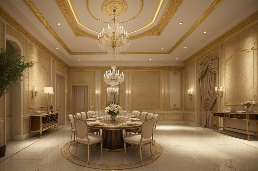
I’ve always advocated for the power of color in a room. When I’m working on a 20 x 40 house interior design project, one of my major considerations is not just the aesthetics, but also the emotional tempo the colors set in the space.
Effect of Warm Colors on Room Mood
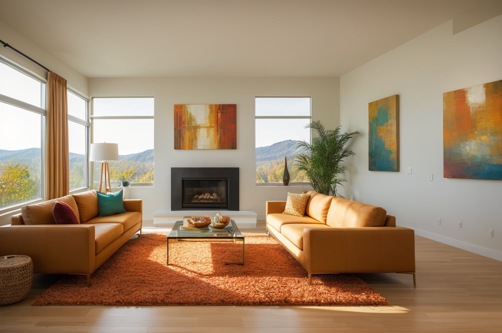
Working with warm colors is like having a hidden magic wand. In one swish, we can uplift the room’s mood and infuse it with energy. Often, I turn to the spectrum of warm hues when designing spaces meant to inspire creativity or spark conversations. They are like inviting the sun in vibrant, invigorating, and full of life.
Influence of Cool Colors on Room Mood
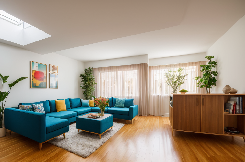
Cool colors, on the contrary, are my secret ingredients for creating sanctuaries of serenity within a home. Have you ever walked in a room and almost instantly felt a wave of calm washing over you? Chances are that room was painted in cooler hues, as they have a unique ability to inspire relaxation and tranquility.
Strategic Application of Warm and Cool Colors
Interior design is not about randomly throwing colors together. Rather, it’s akin to composing a symphony, harmoniously blending warm and cool tones to create a certain rhythm in the room. A triad of warm hues here, an aqua accent wall there, or perhaps a gentle layering of greys – all strategically placed to evoke desired emotions.
Color, my dear reader, is the emotive language of our living spaces. So when reimagining your home’s aesthetic, remember, you have the power to influence the psychological vibrations with your color choices, thus creating sanctuaries that resonate with your unique emotional timbre.
Advanced Concepts in Color Categorization and Selection
In this captivating journey into the art of creating sanctuaries, it’s essential to delve into the complex nature of color categories. These categories are not as rigid as they might seem at first glance. For instance, paints that appear warm or cool at a glance can hold subtle undertones that tilt toward the opposite direction. This reality accentuates the multidimensional nature of colors used in the 20 x 70 house interior design.
Flexibility of Color Categories
Indeed, the category a color belongs to is fluid and can shift based on conditions and perspective. Painting a wall with what initially seems like a warm color may reflect cool tones under varying light conditions.
Importance of Color Temperature, Saturation, and Light Conditions
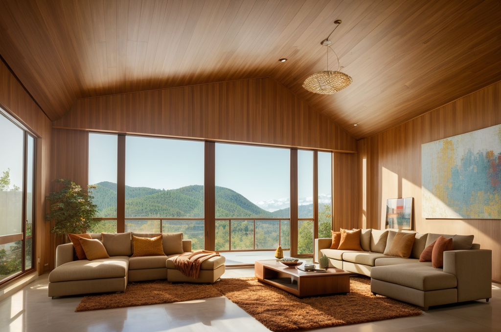
The different layers of a color—saturation, temperature, and how it responds to light—play a central role in color selection. A room’s light conditions can drastically alter a color’s appearance, emphasizing its necessity when selecting a palette suitable for your space.
Role of Neutral Colors in Interior Design
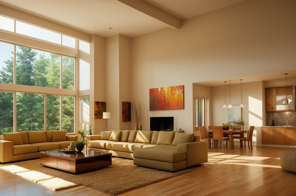
Now, do not underestimate the power of neutral colors. Though muted and understated, they carry within them warm and cool undertones. Neutral shades are indispensable in interior design, adding a layer of complexity and flexibility to home styling. They’re superb for establishing a comforting, balanced ambiance—an outcome that resonates with my desire for harmony in design.
Navigating the vibrant realm of color in interior design can be enthralling. Whether opting for richly saturated hues or leaning towards softer, neutral tones, understanding these advanced concepts can truly elevate your living spaces. So, engage freely, experiment, and let your unique aesthetic journey unfold.
Practical Application of Warm and Cool Colors
In the realm of visual aesthetics, the practical application of warm and cool colors stands as a fascinating journey. Within this exploration, we’ll delve into the intriguing effects that arise from the juxtaposition of warm and cool colors, examine how these hues find purpose in diverse spaces, and shed light on the clever utilization of warm colors in dimly lit environments. Let’s navigate through the realm where color palettes seamlessly weave into the fabric of our surroundings, influencing both mood and functionality.
Effects of Juxtaposition of Warm and Cool Colors
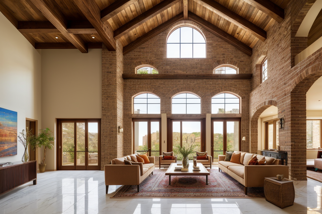
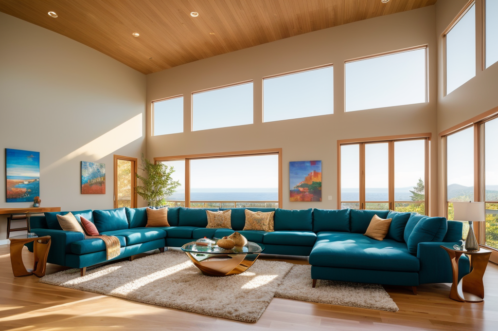
There’s magic in the contrast. Mixing warm and cool colors in amazing house interior designs can take a room from simply nice to visually intriguing. Try juxtaposing various color families to infuse your space with visual interest and dynamism. It’s all about finding the right balance that can do wonders in transforming the room into a captivating canvas of hues and shades.
Use of Warm and Cool Colors in Different Spaces
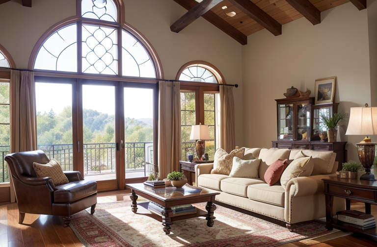
There’s an undeniably powerful connection between color and emotion. As we navigate through spaces, our emotional responses vary. The cozy comfort of a rustic den swathed in warm hues, the serene calmness of a bedroom bathed in cool, tranquil colors our choice of colors can spell the difference in the ambiance and mood of our living spaces. So, whether you’re aiming for a bold, energetic vibe or a relaxing retreat, remember that your chosen palette can drastically influence your space’s overall aura.
Utilization of Warm Colors in Dimly Lit Spaces
Struggling with dimly lit spaces like bedrooms or formal powder rooms? Put the power of warm colors to work! The warm tones, from the faintest whispers of blush to the boldness of burgundy, can foster a calming, tranquil atmosphere, making your intimate spaces cozy and inviting. Still, it’s important to remember that balance is key. Complement these warm colors with appropriate light fixtures, and you’d be surprised at the magnificent transformation of your once dull room.
Throughout this journey in the vast realm of interior design, I continue to find joy in exploring the power of colors. They’ve been my faithful companions, helping to bring to life the designs I imagine. It’s this appreciation for their potency that drives my advice to you. So keep exploring, dreaming, and creating! In the end, the perfect color blend is one that resonates deeply with your personal aesthetic and emotional needs.
Key Takeaways in Using Warm and Cool Colors in Interior Design
Let’s recap the lessons we learned about the influence of color choices in interior design. As we previously explored, the color palette you select for a house interior design does more than contribute to its visual appeal. It crafts the emotive ambience of your living space. Whether it’s a 20 x 40 house interior design or a 20 x 70 house interior design, each hue adds a distinctive note to the emotional symphony of your room.
The Impact of Tones and Undertones
Now let’s delve into the fascinating world of tones and undertones. Just like a well composed music piece, a stunning interior design incorporates not only the primary tones but also the subtler undertones. Comprehending the nuances between warm and cool undertones is critical in bringing the desired aura to your space. This knowledge ensures that our color choices evoke the kind mood we want our creations to convey.
Tips on Strategic Use of Colors
Want to curate amazing house interior designs? The secret lies in the strategic use of colors. By crafting an exquisite contrast between warm and cool hues, you can create harmonious, stunning interiors. Don’t shy away from neutral shades they can serve as the ideal canvas for your color inspirations. Using colors strategically enhances not only the aesthetic quality of spatial design, but also amplifies the sensory experience within that space.
In conclusion, the judicious use of warm and cool colors can transform a visually pleasing space into an emotional sanctuary. Remember, every color sings a unique tune and orchestrating them harmoniously leads to the creation of an unforgettable melodious sanctuary. Enjoy this bewitching journey of translating your vision into reality, one color at a time.