The Power of White and the Rise of Warm Neutrals in Interior Design
White is popular in interior design for its space, purity, and simplicity. It boosts light reflection, enhances art displays and complements wood tones. However, warmer neutrals like brown are trending.
Popularity of White Interiors
White interiors have gained significant popularity, and it’s no surprise why. As an interior designer, I often lean towards a modern white house interior design for its space enhancing capabilities, simplicity, and versatility.
Enhancing Perception of Space
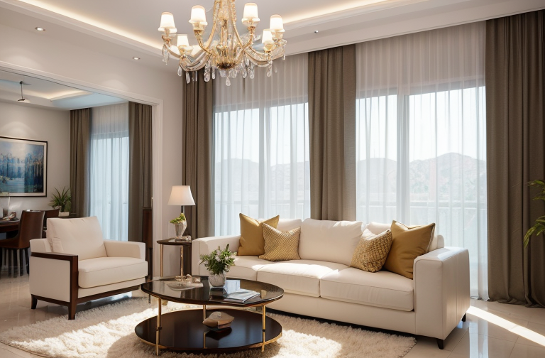
The color white undoubtedly has a unique ability to amplify the perception of space. There’s a sort of illusionary depth that white interiors channel, providing a sense of expansiveness even in confining spaces. It’s a classic trick we designers employ to create a feeling of spaciousness without altering the actual square footage. The color’s pure simplicity and complementary flexibility make it an ideal choice for any interior design project.
As a Canvas for Displaying Art
Opting for white interiors has another added advantage. They can serve as a neutral backdrop for showcasing artwork or decorative items. The absence of competing colors allows the materials, textures, and colors in your fixtures, furniture, or art to truly stand out. It’s like creating your own personal gallery where the pieces of your life become the centerpieces, surrounded by a calming and neutral backdrop.
Light Reflection & Amplification
One of the extraordinary characteristics of white is its optimal light reflection capabilities. No hue can quite amplify natural light the way white does. A room painted in white will naturally feel brighter, fresher and lighter. For those who thrive in sunlit spaces, white walls will enhance and amplify light to brighten up the room.
As an interior designer, the potential of white stimulates my creativity. It’s an exciting challenge to take a blank canvas and transform it into a beautiful and functional space. White interiors can serve as the backdrop where life’s art is played out, and each element in the room blooms by its contrast against the white surrounding.
Designing with White-on-White Furnishings
There’s something captivating about working with an all white interior house design. Let’s dive into the specifics.
Creating a Clean & Fresh Space
When designing a space, I often gravitate towards white on white furnishings. There’s a pureness, a certain tranquility that is weaved within a sea of white. The luminous elegance of this palette offers a clean aesthetic appeal that usher you into a realm of serenity.
Interplay with Other Colors
But don’t be mistaken. A white on white design is not binded by a monotone curse. Instead, consider it as an immaculate, blank canvass ready to be graced with colors. With a sprinkle of hues through cushions or textiles, this design eludes a versatile chicness reflecting varied style and taste with every stroke.
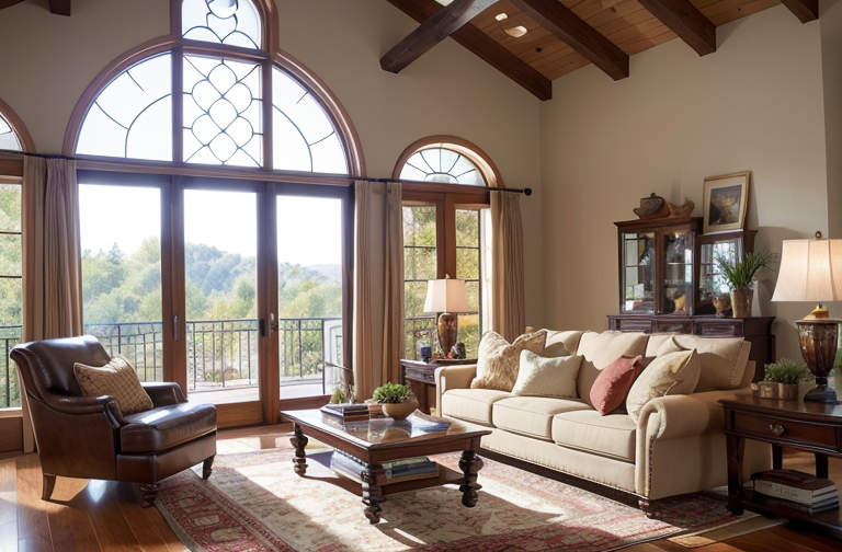
How it Complements Wood Tones
One of my favorite design elements to incorporate is the graceful contrast between a white wall and warm wood tones. The interplay creates a visually stimulating harmony that neither overwhelms nor underwhelms. The result? An exquisite marriage of cool, contemporary aesthetic with earthy, rustic vibes that is soothing to the sight and soul.
Today’s spaces call for designs that not only appeal to the eyes, but also resonate with the emotions. And an all white interior house design, it seems, provides that perfect harmony of visual delight and emotional resonance that transforms a house into a home.
Neutral Colors Enhancing White Interiors
Whether we are designing a state of the art penthouse or a beautiful white house interior design, the tranquility and richness brought by neutral colors can’t be ignored.
Advantages of Using Neutral Colors
Why do I love working with neutral tones? Well, they add depth to white based rooms, preventing them from appearing sterile. Their understated beauty intensifies the aesthetics of a space, allowing for a dimensional, yet cohesive appeal.
Creating a Tranquil Space
Immerse yourself in the serene atmosphere conjured by layers of neutral hues, they thrive in their subtlety. The peaceful surroundings they bring around are just perfect for creating cozy living spaces where relaxation is a priority.
Perfect for Layered Looks
Another intriguing aspect about neutrals is the allure they bring when layered. Various tones overlaid provide an exciting visual texture yet maintaining tranquility. The result is a visually rich setting that intrigues the eye while preserving overall harmony.
In essence, neutral colors are the unsung heroes of design, bridging gaps between form and function to create spaces that are as soothing as they are aesthetically pleasing. So, the next time you’re looking to create a warm, inviting space that soothes the soul and sparks joy, you might want to consider harnessing the potent effect of neutral tones.
Trend Towards Brown Interiors
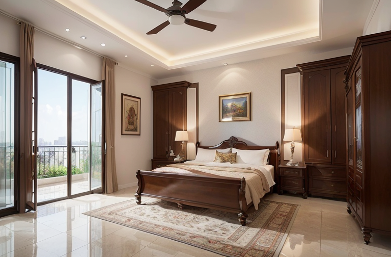
Embracing the warmth of earthly tones, I’ve been noticing a growing trend toward brown interiors. As an interior designer, it’s fascinating to see how shifts in color palettes can impact the feel of a space.
Coziness and Feel of Brown Interiors
Personally, I’m drawn to the cozy, inviting aura that brown colors instill. It’s as if I’ve walked into a room glowing with the soft, welcoming light from a fireplace. Interestingly, it’s a vibrant, simple korean house interior design that first awakened my appreciation for these homely tones.
Contrasting with Brighter Colors
Brown offers an intriguing contrast to brighter colors. It makes the vibrant hues pop, providing a visual feast. Think of the excitement in your eyes when they land upon a burst of turquoise or fuchsia set against a calming brown backdrop. It’s like having your cake and eating it – the comfort of neutrality with the thrill of vibrant shades.
Suitable for Accessorizing
Moreover, brown is a charm for accessorizing. It forms the perfect canvas that allows an array of decorations and accessories to shine fiercely. From metallic accents to pop color cushions and vibrant artwork, brown interiors can accommodate it all without resulting in a cluttered appearance.
But my fondness for the earthy palette isn’t just about the trend. It’s about reclaiming the raw beauty that lies in simplicity, warmth, and the innate connectivity we share with the natural elements. So, here’s to embracing brown interiors and creating spaces that echo our inherent love for cozy, welcoming dens.
Shifting to Natural Color Trends
In line with the current shift toward natural color trends, I’ve been noticing a marked adoption of warmer neutrals such as brown, rust, taupe, and caramel in interior design concepts. These colors exude a sense of tranquility and comfort, and they can perfectly balance the lines between simplistic elegance and rustic warmth.
Adoption of Warmer Neutrals
The move towards warmer neutrals is fascinating and one I fully embrace. These colors evoke a sense of calm and grounding, much like a comforting hug at the end of a long day. They have a sophisticated, timeless appeal, and I find them particularly fitting for a living room or an inviting dining area.
Preference for Nature-Inspired Colors
Looking further ahead, the 2023 trending interior design forecast predicts an uptake in colors rooted in nature. With the blur between indoor and outdoor use becoming less defined, I believe people are yearning for their homes to reflect a closer connection with nature. These natural hues can offer a soothing aesthetic that balances out the technologically saturated world we live in.
Transition away from Sterile Perception of White
Interestingly, among the most significant shifts in modern white house interior design I’ve observed is the move away from viewing white as a pristine, perfect color. The all white interior house design that was once seen as the pinnacle of chic is now often viewed as too sterile or even cold. Instead, even within a traditional beautiful white house interior design, we’ve been seeing a blend with warmer shades or nature inspired hues that create a comfortable, at home ambiance. As opposed to cold, stark white, these combinations create a softness that appeals to the emotional side of us home dwellers.
In my recent projects, I’ve found that combining these trends with elements of simple Korean house interior design can create unique and comforting spaces. I’m excited about this shifting of color trends and can’t wait to see how it will continue to unfold in the years ahead.