Exploring the Versatility and Popularity of Pastel Colors in Modern Interior Design
Pastel colors are trendy in interior design for their versatility, softness, tranquility, and elegance. They can be applied to any room or style, improving aesthetics and enhancing mood.
Introduction to Pastel Colors in Interior Design
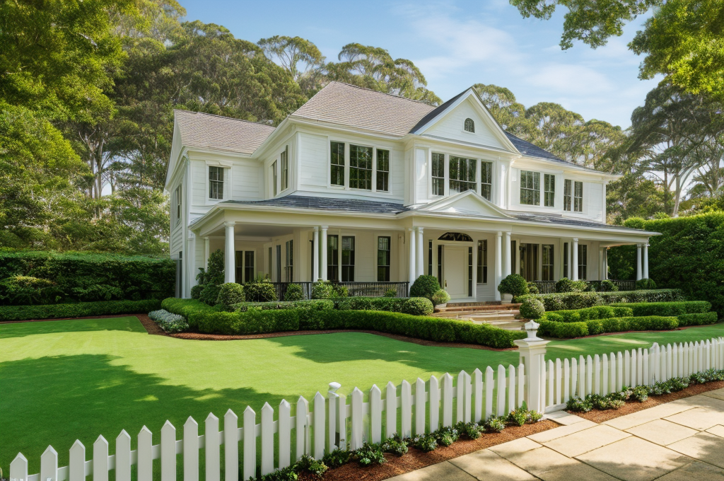
What’s the secret to a serene and soothing living space? You guessed it incorporating pastel colors in your interior design! The calming and refreshing hues of pastel colors have been gracing homes globally, making them a much loved trend in various spheres such as wall paints, furniture, and even accessories. But the intriguing part? They fit perfectly with every style, even in a colonial style house interior design!
Current Popularity of Pastel Colors
Recently, the popularity of pastel colors is witnessing a steady rise. From Instagram to Pinterest, you can spot breezy blues, blushing pinks, and whimsical lilacs adorning homes in all corner of the globe. These subtle tones have a way of lending a delightful charm mixed with a cozy warmth to spaces, making them rule the hearts of many! 💗
Utilization of Pastel Colors in Diverse Spaces and Styles
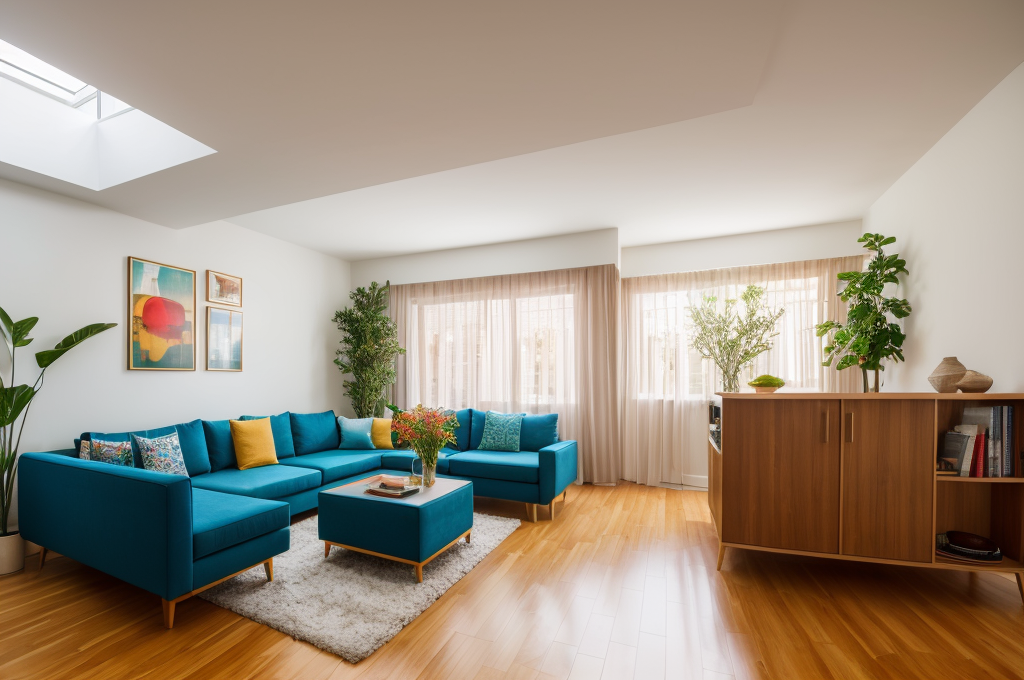
Pastels are no longer limited to nurseries or candy shops. These versatile shades have found their way into living rooms, bedrooms, and even professional spaces. When combined thoughtfully, pastels amplify the sophistication of a space and evoke a range of moods. Whether you’re aiming for an inviting homely aura or a playful, energetic vibe, pastels prove to be reliable allies!
The Resurgence and Trending Nature of Pastel Aesthetics
Pastel aesthetics are experiencing a delightful resurgence too. As vintage aesthetics gain momentum, so do pastel hues, making them a highly sought after trend. With social media platforms like Instagram, TikTok, and Pinterest brimming with exciting pastel inspired décor, homeowners are rekindling their love for this ageless design element. You can frequently spot these soothing tints, paving the way for a laid back and tranquil ambiance.
Versatility of Pastel Colors
Drawing on my time studying the history of design movements, I fondly recall the appeal of the 1980s house interior design where pastel colors reigned supreme. I marveled at the ease at which these colors blended, eliciting feelings of warmth and tranquility, something pastel colors consistently deliver. They’re versatile with a slight simple beauty that cannot be understated. 🎨
Ease of Combining Pastel Colors
Pastels possess an uncanny ability to mingle with one another without any fuss. The reason behind this stems from their shared white or pale undertones. This imbues them with an intrinsic ability to gel together, almost like pieces of a well crafted puzzle. This ease of combining elevates them above other colors, in my view, providing endless possibilities for creativity.
Use of Pastels to Correct Room Imperfections
One aspect of pastels that fascinates me is their role in addressing visible room imperfections. It’s a clever utilization of their modest charm. A savvy designer might utilize a thoughtfully chosen pastel hue to lend balance to a room or to subtly focus attention away from a less than perfect area. This can introduce an elegant touch without overshadowing the overall design.
Harmonious Combination of Pastels with Monochrome Elements
Though they are soothing and light, pastels can integrate efficiently with stronger, monochrome elements. This harmony prevents the design from becoming overly sweet or ’candy colored’. It’s these nuances in color combinations that make the design world so exciting to me. It creates a balance between the serenity of pastels and the boldness of monochrome, bringing about a unique balance only design can achieve. 🖤🤍
Thinking back again on the 1980s house interior design, I can’t help but remember how these vividly yet modestly colored homes radiated such nostalgic charm. And it’s that timeless quality that truly makes pastels a joy to work with in modern times.
Aesthetic Appeal of Pastel Colors
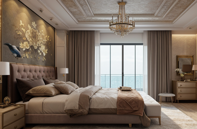
As an interior designer, I’ve always found the soft, mellow aesthetic of pastel colors to be incredibly comforting. These colors create a tranquil, serene atmosphere in a home that is otherwise bustling with activity. There’s a certain soothing sensation that washes over me whenever I step into a room adorned in a palette of pastels. It’s almost like taking a deep, calming breath after a long, stressful day.
Soft and Tranquil Impact of Pastels
Think of a modern colonial house interior design, the quiet elegance it exudes. Pastels embody that same elegance with their understated beauty. Their peaceful demeanor paints a picture of a serene haven, a place where the everyday hustle can be easily forgotten. Just like the soft hues of a dawn sky, pastels bring tranquility to even the most chaotic spaces.
The Role of Pastels in Creating a Serene Atmosphere
Much like how a soft lullaby can soothe a troubled mind, pastel colors also have the ability to create a serene environment. They’re like visual lullabies, delivering tranquility in the form of delicate color. Their tenderness pervades the room, enveloping the space in an environment of calm and peace, much needed for relaxation.
Pastels as a Method to Neutralize Contrast
Their gentle colors offer a striking contrast to the conventional bold, vibrant hues, yet their non aggressive nature does an excellent job of neutralizing rather than challenging contrasts. They establish an atmosphere of calmness, harmonizing multiple elements in a room to create a seamless blend of beauty and practicality. Pastels, with their exquisite charm, are an expression of grace, softness, and serenity in interior design.
Being in a pastel colored room often evokes feelings of peace, tranquility, and a sense of breathable space. To me, that’s the magic of pastel colors in interior design. They manage to invoke feelings of calm and tranquility, all while visually enhancing a space with their quietly elegant charm.
Wide Palette of Pastel Shades
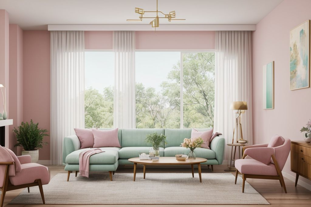
Pastels have a special place in my heart. As an interior designer, I understand the transformative power of color and the variety of pastel shades, from enchanting lavender to refreshing mint green and warm peach, is just astonishing. 🎨✨ The beauty of these shades lies in their creation process. By blending a core color with white or pale yellow, myriad hues come into existence. You may wonder how it’s tied to the colonial house interior design?
Variety of Pastel Shades from Lavender to Mint Green
When it comes to color choices in interior design, pastels offer a gigantic opportunity to transform a space on your whims. Think of a colonial house interior, draped in a swirl of powdered lavender and soft shades of mint green doesn’t that sound like a serene heaven?
The Process of Creating Pastel Colors
Here is the exciting part! Pastel shades are born by infusing white or a pale yellow into a main color. It’s this addition that softens the primary shade, turning it into a muted yet radiant pastel that makes any room feel calming and spacious.
Potential of Every Pastel Shade in Diverse Interior Decor Styles
No two pastels are exactly the same, and each holds infinite potential in different interior design styles. May it be classic, minimalist, or colonial house interior design, pastels speak volumes! For example, imagine a peach inspired living room with gold rimmed fixtures or a lilac themed bedroom with plush white furniture. Each combination tells its own unique story embodying my passion for creating breathtaking sanctuaries.
Color, especially pastels, significantly shapes the mood and dynamics of the space. You explore this wonderful palette and be enchanted by the world of pastels.
Wide-Ranging Applications of Pastel Colors
Transforming a house into a sanctuary always begins by choosing the right color scheme. This step isn’t always easy, given the multitude of options. However, if you prefer a softer touch, perhaps pastel colors would suit your taste. Aesthetics are touched by subtlety here, reflecting a range from colonial style house interior design to 1980s house interior design.
Versatility of pastel colors in various spaces
Why do I love pastels? Well, they are incredibly versatile. Whether you’re recreating a modern colonial house interior design or adding a hint of nostalgia with a throwback to the 1980s house interior design, pastels can effortlessly fit into the narrative. They add a distinct softness that often counteracts harsher elements, making them ideal in a bevy of spaces throughout your home.
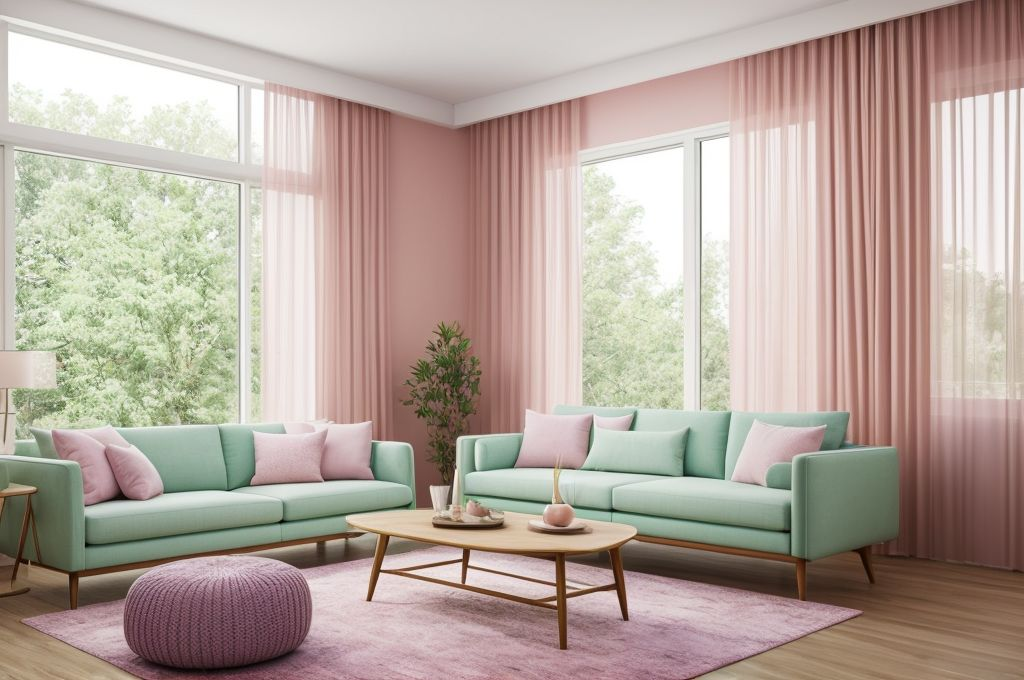
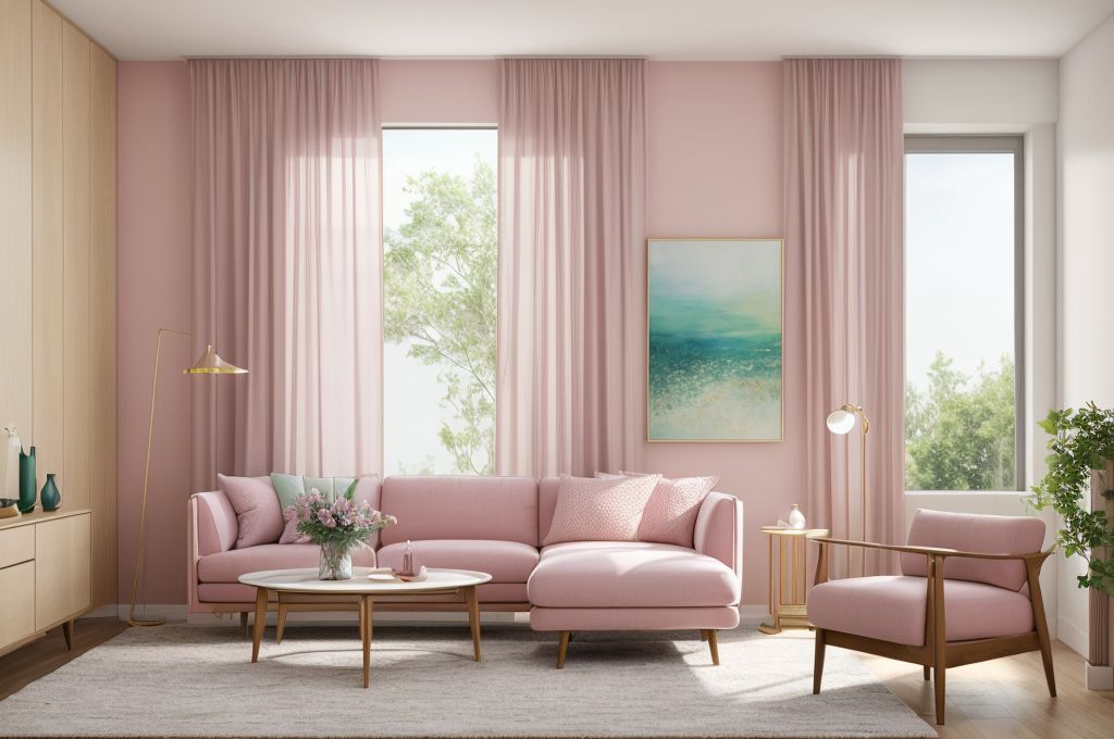
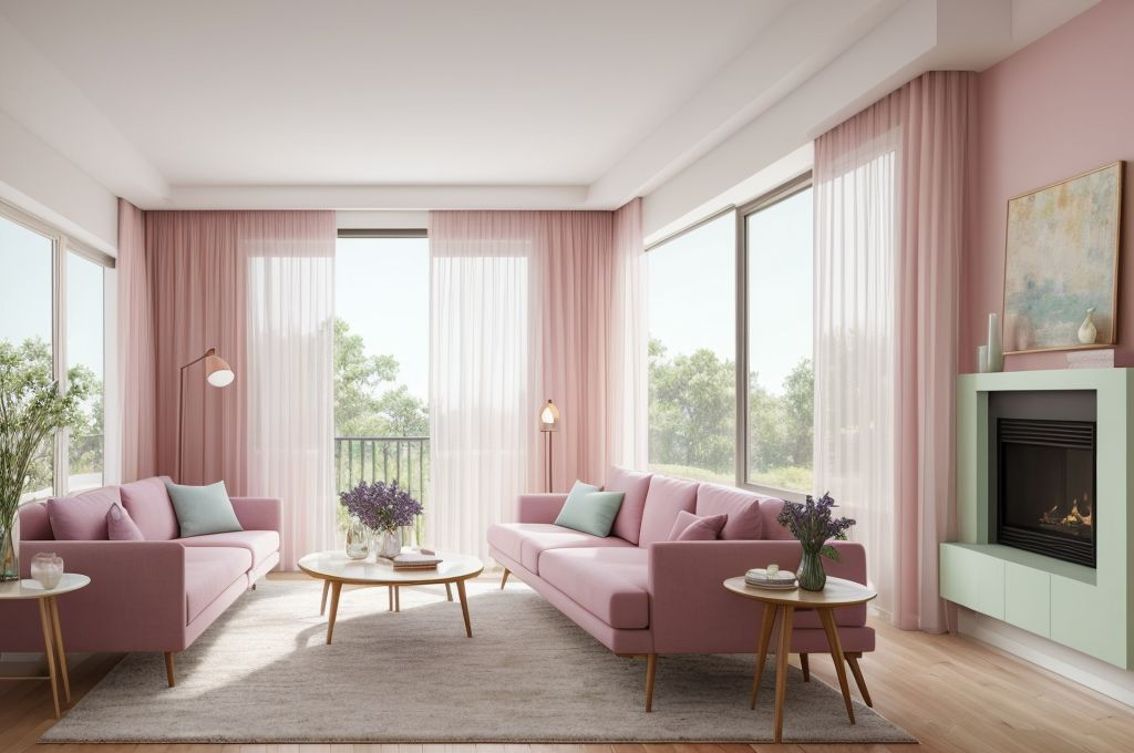
Use of pastel colors in textiles, paintings, and accessories
As an aficionado of creative interiors, I often incorporate pastels in all sorts of places. Walls are the most evident but don’t overlook textiles – cushions, rugs, curtains – to add that soft pastel touch. And then, there are paintings and accessories. Pair pastel hued vases, coffee table books, and little trinkets together for a lovely effect that’s gentle on the eyes.
Minimal risk of overwhelming the space with pastels
One of the elements I adore about pastels is that it carries a minimal risk of overwhelming any space. Unlike bolder hues, its softer palette casts an inviting glow without demanding too much attention. This offers wonderful flexibility, whether you’re contemplating a colonial house interior design or simply adding a serene touch to your living space.
In conclusion, pastels truly have a place in every home, bringing a refreshing, light touch that is versatile and balanced, unintrusive yet distinct. Go ahead, delve into the soothing world of pastel colors and witness the magic they weave into your interiors.