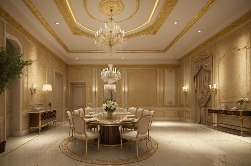
Utilizing Shades of Blue in Interior Design: From Tranquility to Vibrancy
The article explores the use of the color blue in interior design, its varying shades and significance, renowned designer Beth Lindsey’s approach, integration with other tones, and the aesthetic impact of blue.
The Versatility of Blue in Interior Design
The captivating allure of blue in interior design, It’s popularity isn’t just a trend. There’s a magnetism about this color that’s truly timeless. In fact, incorporating blue is one of my favorite terraced house interior design ideas for its ability to introduce tranquility, depth and clarity. 💙
The Popularity and Appeal of Blue in Interiors
Why is blue such a favored choice, you ask? It’s all about the feelings it evokes. I find that this hue connects with people on an emotional level as it makes them feel grounded and soothes their senses. Moreover, it’s a color of depth and stability, it makes spaces feel much more substantial and balanced.
The Role of Varying Shades of Blue in Creating Different Atmospheres
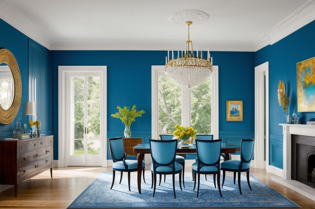
Then there’s the versatility of blue. The beauty of it lies in its wide spectrum of shades, each capable of creating a unique atmosphere. You can go bold with a dark navy to create drama or opt for a softer shade like powder blue for a more subtle touch that whispers of serene skies and calm seas.🔵🟦
The Benefits of Blue in Highlighting Architecture and Increasing Light
An aspect of blue I absolutely adore? It’s fantastic for highlighting architectural features, with its depth adding a stunning contrast that emphasizes shapes and lines. And, maybe surprisingly, blue can amplify light within a space when applied in a glossy finish. It acts like a little magic trick, making a room seem bigger and more luminous!🌟
It’s truly remarkable how one color has this extraordinary ability to create so many different moods and effects. From soothing to stimulating, subtle to dramatic, blue truly is a remarkable player in the world of interior design.
Looking into Blue Shades
As an interior design aficionado, I’ve spent countless hours exploring the transformative power of color, specifically the range of emotions that different shades of blue can evoke. Assume for a moment a room painted in deep navy. Can you feel the drama it openly dares to express? Now, contrast that with the tranquil innocence of a sky blue touch or the calming effect cleverly evoked by cadet blue.
Varieties of Blue and the Feelings Each Shade Evokes
Just as the colors of the sky seemingly know no end, so do the varieties of blue at our disposal. Each shade gracefully casts its distinct mood, often having a profound impact on our emotions. Deep navy conveys an intense drama, while sky blue hints at tranquility. Cadet blue, on the other hand, consistently ensures a serene ambience, proving to be a go to choice when aiming for a calming effect.
Selection of Blue Shades Based on Room Types and Desired Atmosphere
When it comes to room specifics, the shade selection narrows down but takes a more strategic turn. The intensity of imperial blue, for instance, is highly effective at inducing the perfect restful night’s sleep in bedrooms. In look for that cool coastal vibe in your terrace house interior design ideas? A splash of turquoise blue will do justice in this case.
Integrating Blue Shades with Room Themes
It’s also worth appreciating the diversity of sapphire and navy blue in their compatibility with emerging and timeless themes alike. These two shades open up a plethora of possible home décor narratives, from minimalist through mid century to coastal.
The art of color selection, even within a single hue like blue, is as complex as it is fascinating. The challenge rests not in the limitation of options, but in the sheer expanse of possibilities.
Beth Lindsey’s Approach to Using Blue
Oh, the color blue. It’s a constant in my design portfolio and for good reason. It’s not just a color for me, it’s a tool I employ to create the desired atmosphere in any space.
Significance of blue in my design portfolio
Blue is a darling hue in my work, and truth be told, it often takes center stage in many of my small terraced house interior design ideas. Why, you ask? Well, it’s versatile, elegant, and utterly timeless. Blue has an uncanny way of embodying both calm and vitality, depending on the shade and context.
The calming effect of blue in my designs
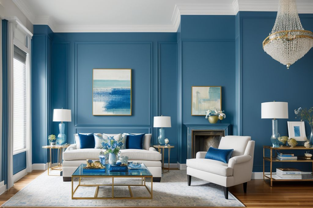
Take, for instance, the calming effect of blue. Have you ever walked into a room awash in a gentle sky blue and felt a wave of tranquility wash over you? That’s the power of blue! It’s also a notably versatile color. Whether it’s a light pastel shade to soften a room or a dramatic navy blue to add depth and drama.
Different contexts where I use blue shades
Just like the multi faceted Beth Lindsey, I strategically select blue shades according to the room type. Think a serene baby blue for a restful bedroom, a vibrant turquoise for a lively living room or a sophisticated midnight blue for a chic study. Yet, my usage of blue also depends on the overall theme and elements of the room.
Using blue is about crafting a particular mood, defining space, and to be perfectly honest, channeling a bit of personal style into each design. Trust me, even in the world of interior design, you can’t take the blue out of the girl!
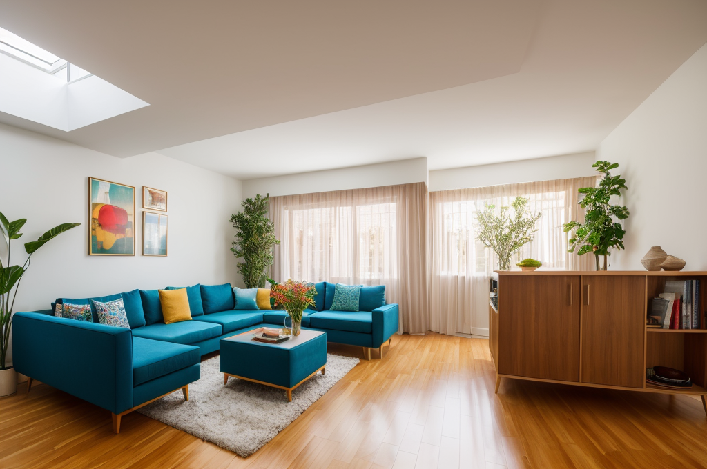
Combining Blue with Other Tones
As a lover of color and its power to transform an ordinary room into a wistful sanctuary, I’ve come to appreciate the versatility of blue above other hues. Blue, in all its mystic shades, dances well with many color partners and can serve as a neutral base in a terrace house interior design. This neutral base quality makes blue exceptionally adaptable to various design styles.
The Suitability of Blue as a Neutral Base
You might be wondering, ”A blue wall? Isn’t that a bit much?” But the reality is, these shades of azure can be serene and comforting, making them perfectly suited to spaces meant for rest and relaxation such as bedrooms or reading nooks. Blue, despite symbolizing the sea and the sky, does not necessarily need to feel nautical or airy. It can also be sophisticated and even urban, depending on the tones you decide to mix it with.
Mixing Blue with Earth Tones for Urban Spaces
Specifically concerning terrace house interior design, a moodier palette can be derived through the artful combination of blue and earth tones. The sultry marriage of these colors can encourage an urban vibe, ideal for those striving to create a city oasis amidst a bustling suburban environment. The beauty lies in the contrast it builds, emulating the deeper hues of the city skyline against the vast indigo of the nighttime sky.
Creating Ethereal Glow with Variations of Blue
Manipulating variations of blue can also produce an ethereal glow, adding an extra layer of aesthetic charm to any room. Imagine waking up every morning surrounded by hues reminiscent of the first light of dawn or sinking into a comfortable chair amidst the subtle glow reminiscent of twilight. The magic therein is the timeless element of nature and tranquility it imbues into your living space, making your home your haven.
These color collaborations give rise to endless design possibilities, ensuring that each space, each nook, and every corner resonates with individuality and comfort the conscious choirs of good design.
Aesthetic Implications of Blue
As an interior design aficionado, I thrive on the potential to create spaces that are unique, expressive, and reflect the style of its inhabitants. With color playing a quintessential role in achieving this result, today, I tackle the intriguing versatility of the color blue.
Enhancing Architectural Elements through Blue
With my love for timeless aesthetics such as terraced house interior design ideas, I’ve come to appreciate how a streak of blue can create magic in any space. A well placed hue, like a cool midnight blue, can enhance various architectural elements, like high ceilings and stair rails, adding depth and interest. It’s akin to highlighting the artistry and charm of terrace house interior design.
Injecting Personality into Neutral Spaces with Blue
Neutral spaces can sometimes feel a bit impersonal. I’ve discovered that some small terraced house interior design ideas can be implemented to bring in warmth. A splash of blue, whether on a piece of furniture or an accent wall, can provide that personal touch. It’s all about finding that right balance between sophistication and individuality.
Adhering to Themes with Specific Blue Shades
Working within a theme can be both challenging and exciting. Every concept, like terrace house interior design, becomes a puzzle where each element must fit to reveal the bigger picture. Navy tones are perfect for maritime themes while pastel blues can depict winter sceneries. Every hue, essentially, holds the power to evoke different emotions and complement varying themes.
The versatility of the color blue extends to providing that transformative touch while respecting the practicality of a space. Hence, it remains a go to option in all of my design ventures, effortlessly bridging the gap between beauty and functionality.