Mastering the Art of Colors in Interior Design: Strategies, Trends, and Inspirations
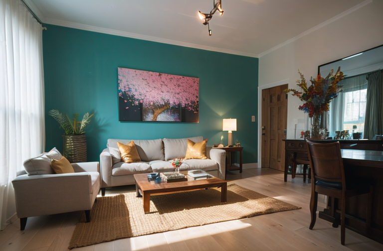
Explore color’s significance in interior design, learn combination strategies, color schemes, seasonal palettes, and specific recommendations for room colors for a refined look.
The Essentiality of Color in Interior Design
As a lover of the transformative power of spaces, I wholeheartedly believe that color is the silent language of design—the understated hero that has the power to evoke, to soothe, and to shock. My journey with triangle house interior design was an exploration of the energy that colors can bring to a space.
The Psychology of Colors
Taking you through my experience with color psychology, I’ve witnessed how incorporating various hues can tell different narratives and impart unique experiences.🎨 Each shade, from earthy browns to vibrant yellows, has a story to tell and an emotion to convey. Even the most seemingly insignificant nuances of a color’s tints, tones, and shades can subtly yet significantly influence subconscious perceptions.
Influencing the Mood with Color
Dive into the world of colors with me, and you’ll understand how it can create different moods and atmospheres. Picture the tranquility evoked by a palette of cool blues or the vibrancy of bold reds sprinkled throughout a room.💙❤️ The distinct energy each color releases can harmoniously blend into the background or audaciously demand attention.
The Power of First Impressions
The first splash of color seen upon entering a room shapes its initial perception—the first leap into the emotional journey that space offers. Colors that align with the theme of the room could extend a warm welcome or emanate a serene vibe, making you want to kick your shoes off and stay a while.
The silent symphony of color elements in design is a fascinating reality that often goes unnoticed, but is undeniably instrumental in shaping our environments!
Unveiling Color Combination Strategies
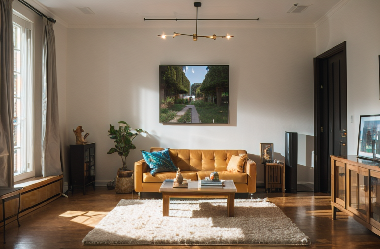
I’ve found that mastering the art of color combination is key to creating satisfying and emotionally resonant interior house design color schemes. Let’s delve into three essential tactics I frequently leverage during my creative process.
Pairing Similar Temperatures
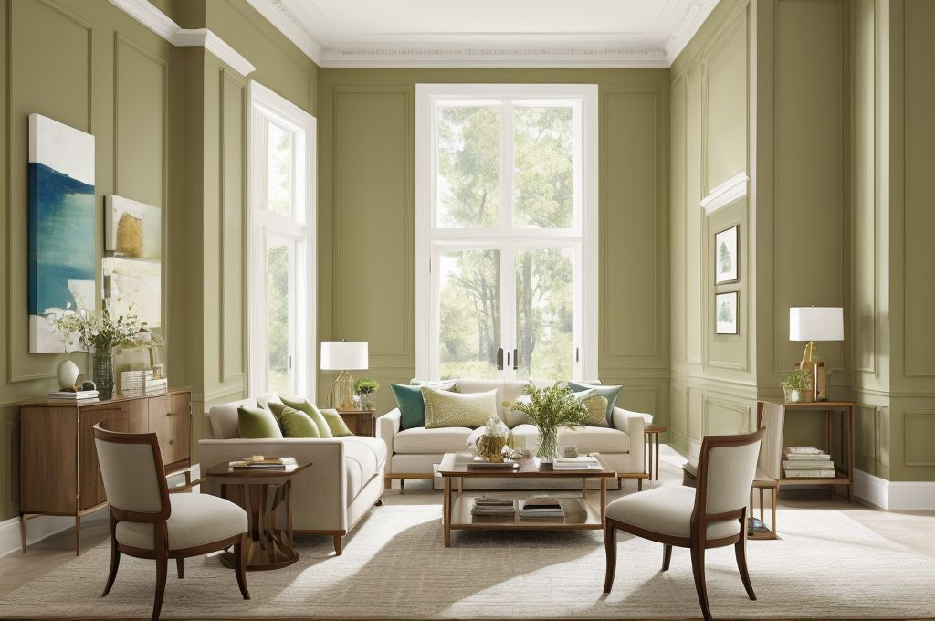
I often establish a harmonious feel by coordinating colors of similar temperatures. Partnering warm hues with warm and cool with cool mitigates discordance, producing a balanced yet exciting visual experience. An idea here would be to combine a subdued sage with a rich navy, both cool tones, to evoke a sense of structure and tranquility.
Experimenting with Monochromatic Palettes
Working within a monochromatic color scheme can offer a distinctive, sophisticated style. I explore variations of a single hue, employing shades, tones, and tints, to craft a design that’s clean yet dynamic. When curating a monochromatic scheme, I consider colors with versatile depth, such as turquoise. Its variant shades can range from almost white to nearly black, tantalizing the viewer’s eye.
Exploring Complementary Colors
While alike colors tend to convey unity, contrasting colors also have a unique allure. The pairing of complementary colors can stimulate visual interest while maintaining harmony. For instance, if I’m aiming for a vibrant, energizing ambiance, I might pair a bright orange with a serene blue, challenging traditional design norms with audacious creativity.
The interplay of colors is an exquisite dance that commands our emotional response to a space. By understanding the nuances of color combination in my artistry, I can render a living area that beautifully narrates the unique story of each my clients.
Creative Utilization of Color in Different Rooms
As an interior designer, implementing outstanding color concepts within spaces forms the cornerstone of my work. Specifically, in the realm of bohemian house interior design, color use significantly dictates the overall atmosphere and emotional impact of a room.
Dual Toned Rooms
Take for instance dual toned rooms. There’s an undeniable artistry in perfectly merging hues like turquoise paired with cream. Or perhaps the slightly audacious yet harmonious blend of viridian green and purple. These color combinations not only define the room’s character, but also give it a unique aesthetic edge.
Luxurious Color Combinations
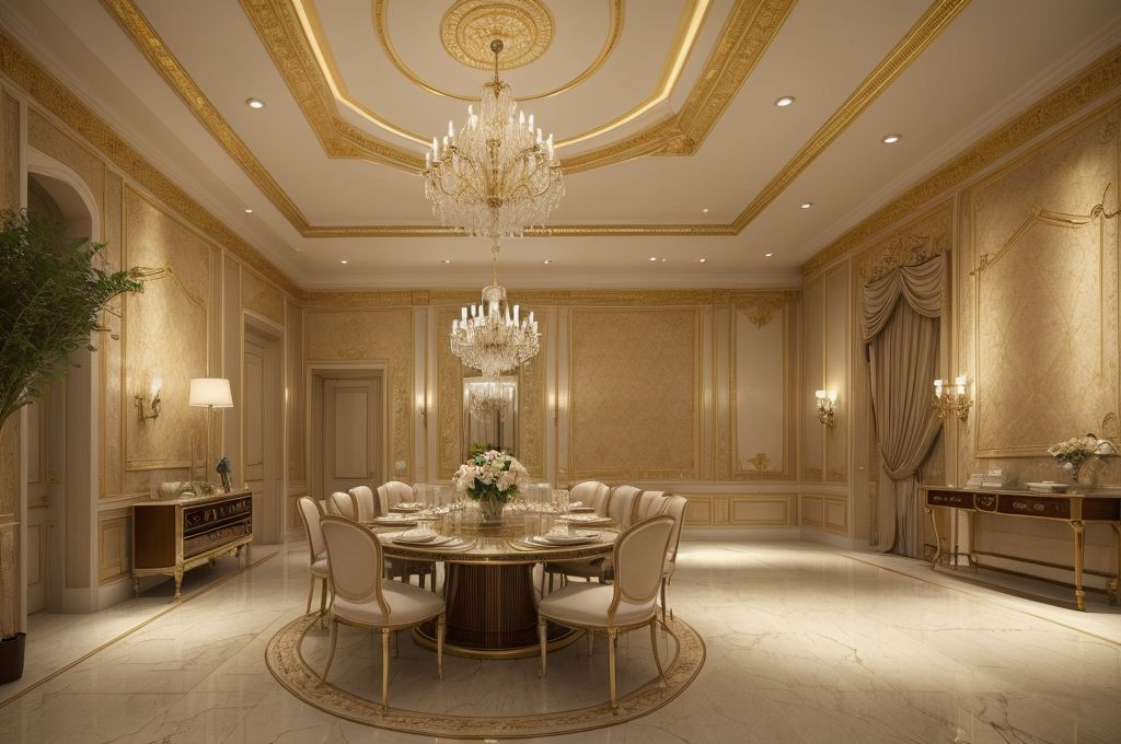
Then there’s the challenge to evoke an added sense of opulence with colors. Extravagant color blends like gold and royal blue often do magic that is no less than a luxurious spectacle. Such schemes have a knack of injecting refinement and sophistication into any living space.
Vibrant Color Mash-ups
But my particular favorite is the strategic placement of vibrant color pairings. A mix like yellow and grey or the unusual combo of blue grey and carrot orange can bring an unexpected freshness into the room. These combinations leap beyond the regular palette, providing a more visually arresting experience.
So, in utilizing colors effectively in different rooms, I find that the results can illuminate the spatial personality, dictating mood, and inevitably carving out a unique narrative for every home. As they say, life’s too short to live in a beige box. Go ahead, embrace the colors!
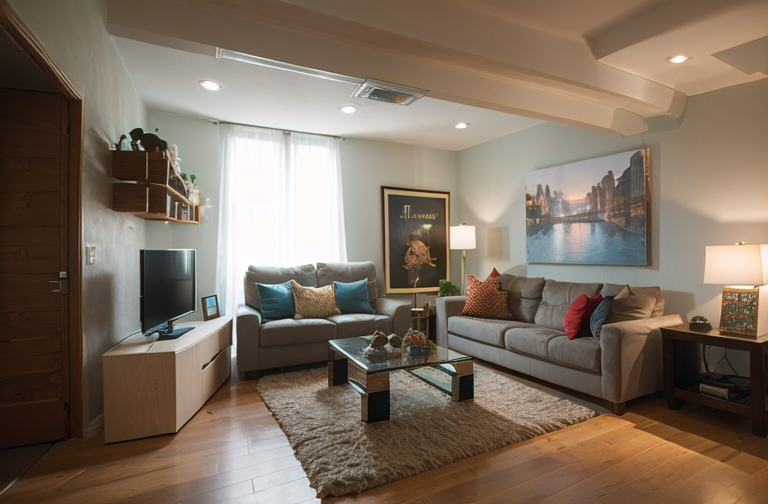
Guided Exploration of Color Palettes
Current and Emerging Color Trends
Being deeply embedded in the industry, I find joy in tracking the pulse of color trends. From popular shades that dominate the market to the subtle emergence of new hues, it’s a thrill to witness the ebb and flow of the color landscape each season. Using my expertise in interior design paint colors for small houses, I curate these insights, providing a journey into the world of vivacious colors and calm neutrals that enhance the appeal of any domain.
Seasonal Color Insights
There is something magical about aligning your interior spaces with the colors of each season. From the blooming magnificence of spring shades to autumn’s cozy, warm palette, I reckon all seasons bring forth an array of colors waiting to be harnessed. Nature, in its infinite wisdom, provides us with the most harmonious color combinations, and I absolutely relish providing insights into how these can be incorporated into your homes.
Situational Color Choices & Recommendations
From an enchanting nursery room to a tranquil home office, every ambiance requires careful selection of color palettes. I believe that not only should the colors echo personal preferences, they should also cater to the function and mood of a room. With a thorough understanding of the psychology of colors, I can make recommendations that accurately reflect the disposition you wish to evoke through the interior design of your space. Using guiding principles and my expertise, I guarantee my recommendations will add grace and charm to your home.
Tailored Color Palette Selection
There’s a certain allure to monochromatic motifs, especially when we talk about the classic black and white combination. Black and white interior house design color is a timeless staple in the world of design. It’s not just about its simplicity, but it’s also about how it can magnify the appeal of the other elements in the room, creating a stunning contrast that frames the triangle house interior design.
Usage of Black and White
Going with a black and white palette does not limit your creativity. In fact, it sets a strong foundation for subtler elements to shine. Bohemian house interior design is one style in particular that benefits from this stark contrast, allowing the vibrant details in artwork, textiles, or curios to be more vivid and pronounced.
Valentine’s Day Color Theme
Speaking of colors that evoke emotion, there’s no denying the impact of a Valentine’s day palette in creating a romantic vibe. Dreamy and evocative, incorporating hues of red, pinks, and plush purples, can stimulate warmth and affection. This interior design paint colors for small houses can add a touch of intimacy perfect for bedrooms or lounges.
Feminine Color Palette
A a feminine color palette resounds with calming charm. The mix of dusty pink, lilac, and subtle blue creates a placid composition that soothes and welcomes. It’s inviting and nurturing, a design style element that encapsulates comfort and tranquillity. This scheme beautifully brings out the many subtle nuances within my interior design work.
At the end of the day, the colors you choose for your space should align with your personality and lifestyle. Whether it’s monochromatic, jovial, or calming feminine, every color imparts an overall impression that feels intimate and personal to you. It’s all about artfully creating a space that resonates and speaks volumes about your preference and taste.
- Unlocking the Intricacies of Interior Design: Ranch-Style Homes and the Pursuit of Functionality
- Blending Tradition and Modernity: Exploring the Design of Nipa Hut and Trynagoal Tea House
- Enhancing Dining Experiences through Creative Interior Design and Rebranding in Burger Restaurants
- Mastering Home Renovation: The Crucial Roles of an Interior Designer and Effective Budget Management
- Understanding the Value of Interior Designers: Roles, Benefits, and Selection Process
- Exploring the Richness of Turkish Architecture and Interior Design through Adobe Stock and Pinterest
- Unveiling the Unique Characteristics and Design Elements of Ranch-Style Houses
- Embracing Openness and Personal Touch: The California Ranch House Interior Design Concept
- Embracing Warm Minimalism: The Rise of Brown Tones in Interior Design
- Enhancing Your New Home: Key Elements and Strategies in Interior Design
- Unveiling the Art of Luxury Interior Design: Exploration of Materials, Individual Style and Inspiration from Pinterest
- 13 Easy and Affordable Tips to Spruce Up Your Home Decor
- Exploring the Rich History and Distinctive Features of Tudor Architecture
- Exploring British Home Interiors: From Historical Evolution to Modern Adaptation
- Traversing the World of Interior Design: From Designer Profiles to DIY Ideas and Future-ready Furniture
- Contemporary Home Refinement: Leveraging Exposed Brick Design and Affordable, High-Quality Furnishings
- Exploring the Warmth and Charm of Modern Rustic Interior Design
- Enhancing Duplex and Triplex Interiors: An In-Depth Guide to Style, Lighting, and Effective Use of Space
- Creating Your Dream Bathroom: A Comprehensive Guide to Designs, Functionality, and Material Selection
- Creating Your Personal Spa: Insights into Modern Bathroom Design Trends
