Color me Trendy: Bold and Beautiful interior Design Color Trends of 2023
Bold, vibrant hues and colored lighting will gain popularity in 2023, alongside warm neutrals, jewel tones, and pastels. Shades of green and blue are expected to dominate interior design trends, with timeless color combinations and unexpected pairings also in demand.
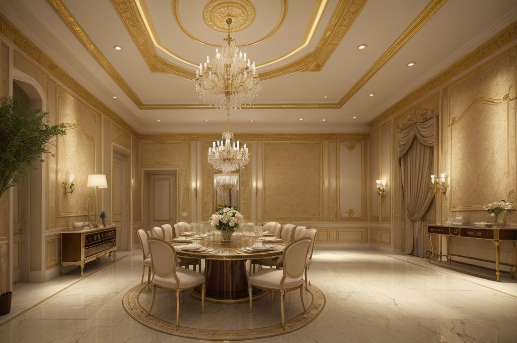
Bold and Vibrant Colors
Look forward, my friends. The landscape of interior house design color is shifting towards dramatic hues. This wave of change lures us away from relaxed, serene shades, embracing the power and richness invoked by bold colors.
Shift Towards Dramatic Hues
The year 2023 will usher in a new era for home interiors, marked by an explosion of bold colors. The calm palettes of the past are making way for striking counterparts that command attention and breathe life into our living spaces. These hues aren’t just for adding visual interest; they set the stage for our daily experiences, mirroring our emotions and enhancing our spatial perception.
Impact of Vibrant Colors
Vibrant colors aren’t merely aesthetic components; they play a paramount role in shaping our emotional responses. These dynamic shades trigger feelings of power, richness, and enthusiasm, transforming otherwise mundane spaces into inspiring environments. Each vibrant color maps out a unique narrative, making your home a living testament to your personality and style.
Power and Richness Invoked by Bold Colors
The gravitation towards bold colors signifies more than a transition in design trends. It represents an embrace of power, richness, and daring individuality. These dramatic hues infuse an unmatched depth and dimension into our interiors, transcending aesthetic appeal to create soulful sanctuaries that resonate on an emotional level.
In my world, color is a vital instrument in composing the symphony of interior design. With the coming tide of bold, vibrant shades, we’re poised to explore uncharted territories in the art of space curating, making our homes echo our unique stories even louder. Let’s trailblaze together into this exciting chapter in interior design history.
Influence of Lighting in Color Schemes
The charm of a well designed space lies in the subtle details, like how a room’s lighting influences its color scheme. As someone deeply fascinated with the interior design world, I’ve been particularly drawn to the role of colored lighting in setting a room’s ambiance. Since as far back as when I was exploring triangle house interior design, I’ve seen how a strategic infusion of colored lighting can enhance a room’s mood, creating a surreal, immersive atmosphere ❤️. Upcoming trends in 2023 predict a rise in the use of colored lighting, making it an element to watch out for.
Role of colored lighting in room ambiance
Through my time at the School of Design at Parsons and beyond, I can vouch for the fact that achieving just the right play of shadows and lights can be as challenging as it is rewarding. Different hues bring out different emotions, which is why it’s essential to strike a balance with the right colored lighting 🌈.
Use of neon signs
Adding to the colored lighting trend, the clever use of neon signs can drastically alter the visual appeal of a room. The vibrant glow can lift a room’s aesthetic, each color emitting a different aura, each lure being unique ✨.
Interaction of lighting and color schemes
More than just illuminating a space, lighting plays an integral part in how we perceive color schemes. The interplay between different light sources and a room’s color palette can create varying effects, some subtly calming and others energetically stimulating. Combining the right hues of lighting with your chosen colors indeed takes interior design to another level. The possibilities are endless, a fact I adore about this field.
Keep experimenting and exploring new design frontiers! Who knows? You may come across your game changer in the vast universe of interior design.💡🎨
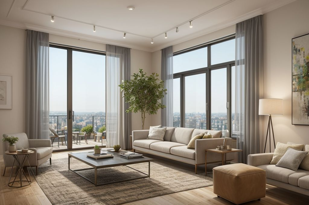
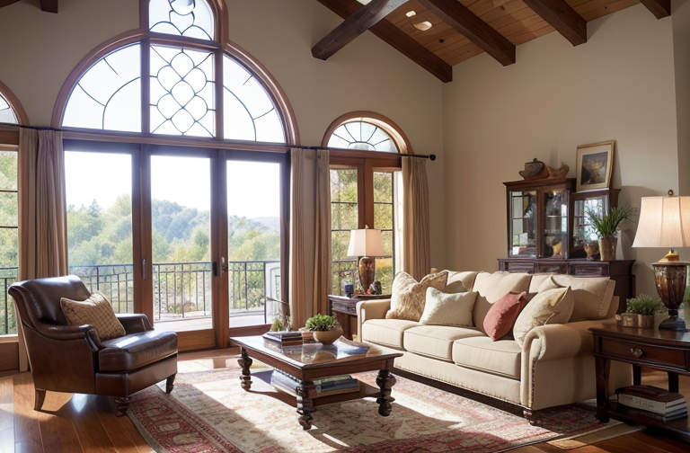
Relevance of Warm Neutrals
I have always admired the power of color in interior design. Warm neutrals, for example, can completely transform any space, and the interior design paint colors for small houses often lean towards these tones. These soft hues evoke a sense of comfort and stability that is purely soothing. Let me break it down for you.
Importance of Soft Warm Colors
Soft warm colors do more than just add aesthetic appeal. They also create an ambiance of comfort and relaxation that we all crave in our living spaces. A touch of gentle violet or the pink of softness can make a house feel like a sanctuary. It’s these subtleties that can turn a dwelling into a home.
Dominance of Warm Neutrals in Interior Design Trends
What I’ve discerned over the years is that warm neutrals like variations of brown, ultramarine blue, and raspberry blush are anticipated to be trendy. Expected to have a significant impact on interior design, these shades are more than just fleeting fads. They provide depth and flexibility, making them a favorite choice in today’s interior design landscape.
Variations and Shades of Warm Neutrals
No two neutrals are alike. There are multiple shades and variations even within one color. From the ever popular eggshell and ivory to beige and taupe, each shade brings a distinct personality to the space. Fashion forward colors like ultramarine blue and raspberry blush are also gaining popularity as they blend modern vibrancy with classic class, creating spaces that are both inviting and stylish.
As we delve into the design world, it becomes clear just how integral warm neutrals are to shaping our living spaces. They set the stage for our lives, creating a backdrop that both inspires and enlightens.
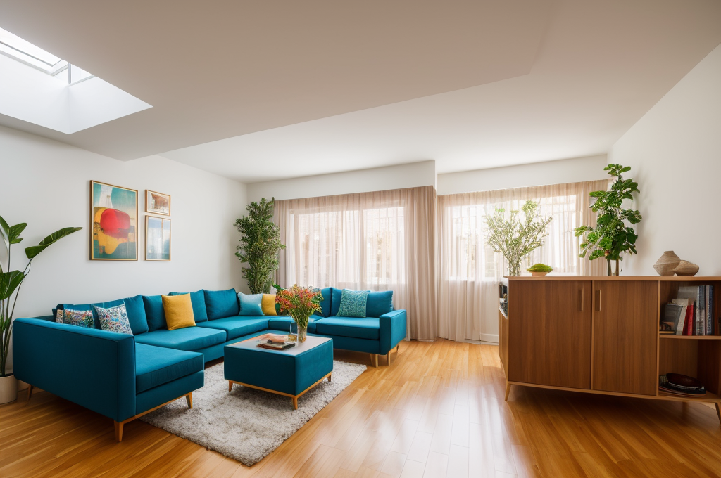
Emergence of Unexpected and Timeless Color Combinations
As an interior designer, I always find myself entranced by the potential of color. It’s the primary element that determines how a space feels and evolves. Recently, there has been a noticeable uplift in the popularity of unexpected color pairings for house interior design color schemes.
Popularity of Unexpected Color Pairings
For instance, who would have imagined that a deep sapphire lacquer would lend an air of sophistication when integrated with chartreuse silk drapes? I absolutely adore these idiosyncratic combinations; they infuse the spaces with a sense of individuality, a kind of magic that’s both enchanting and surprising.
Continual Preference for Timeless Color Combinations
On the other end of the spectrum are our ever endearing classics. Black, white, gray, green, brown these neutral combinations are timeless for a reason. These color schemes have a universal appeal that transcends fleeting trends, laying the groundwork for a home that feels both comfortable and refined, year after year.
Cultural and Industry Impact on Color Pairings
It’s exciting to see how our industry is embracing more innovative color pairings. Designers are pushing the envelope, departing from traditional norms, and instead, weaving together cultural nuances and technological advances to dream up fascinating combinations. I believe this shift is fostering a future where our interior spaces can truly reflect our personalities and lifestyles, making our homes more meaningful and vibrant.
In a nutshell, whether we’re leaning into the avant garde or finding solace in the tried and true, the allure of color is undeniable in the realm of interior design.
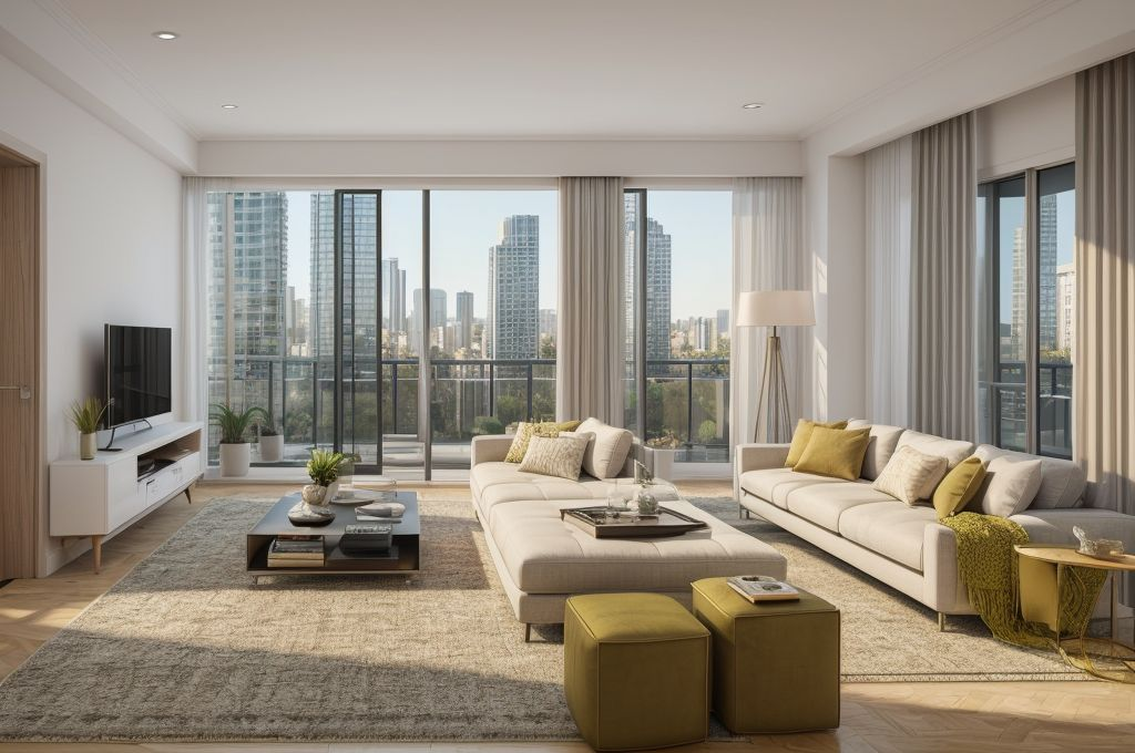
Impact of Mid-century Modern Colors, Jewel Tones, and Pastels
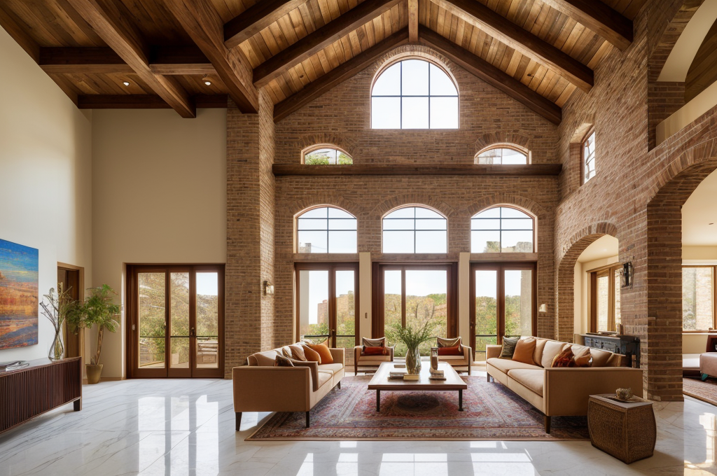
I’ve observed a delightful resurgence in the use of mid century modern colors in interior house design color. These incorporate earthy tones like ochres and browns, gentle hues of soft whites, and splashes of warm neutrals, and piquant reds. These colors usher in warmth, comfort, and an evocative nod to the past that resonates with my appreciation for historic design movements. I adore the way such colors can alter the mood of a space, subtly influencing the way we experience our living environments.
Influence of Mid-century Modern Color Palette in Interior Design
In the field of triangle house interior design, the impact of the mid century modern color palette should not be underestimated. The muted tones bring an inviting energy to the room, crafting an atmosphere of tranquility and relaxation, akin to a cozy retreat.
Prevalence of Jewel Tones and Pastels in Color Trends
Looking forward, I predict that jewel tones and pastels, particularly dusty blue and clay, will influence the interior design paint colors for small houses in 2023. These hues imbue a sense of serenity, as they mirror the tranquility of natural landscapes, infusing homes with a restful ambiance.
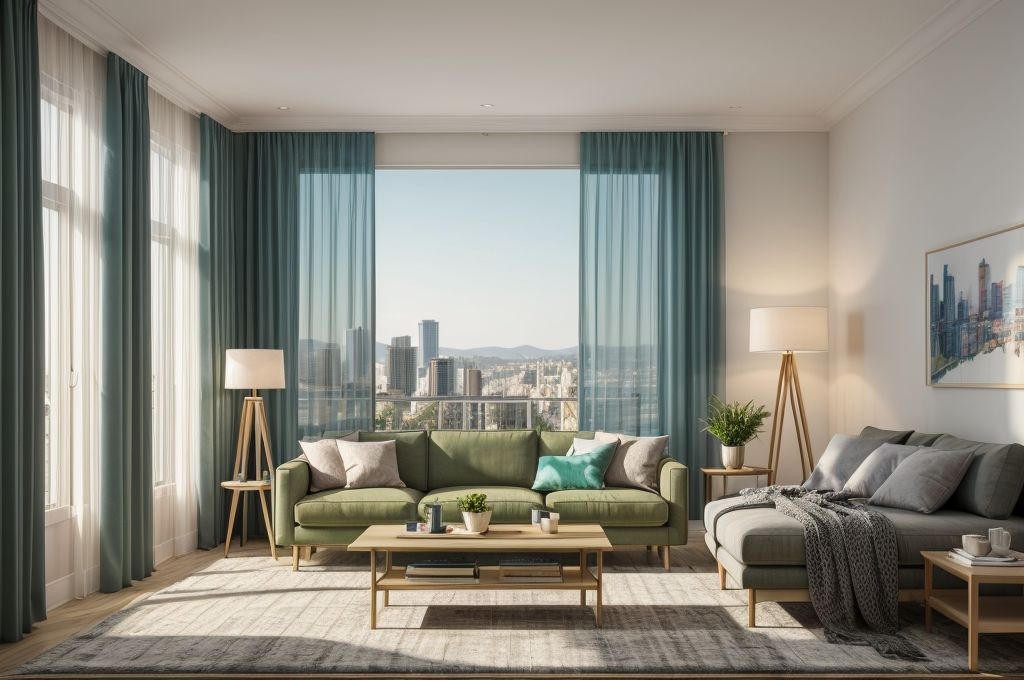
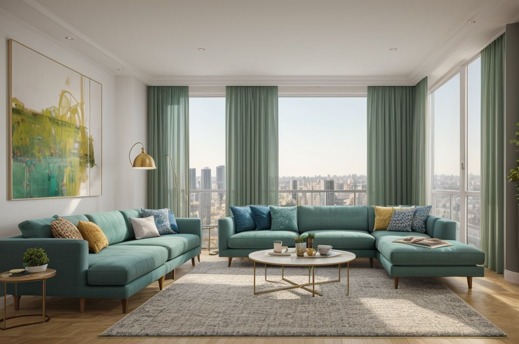
Role of Nature-Inspired Colors like Green and Blue
Nature inspired colors, particularly green and blue shades, are also experiencing a resurgence in popularity within house interior design color schemes. These colors invite the calming essence of the great outdoors into our homes, creating spaces that are serene and soothing. The draw of green and blue shades is in their ability to cultivate peaceful sanctuaries in the midst of our often chaotic lives.
In conclusion, the trends in interior house design continue to evolve. From mid century modern palettes to jewel tones and pastels, there’s inspiration to be found in many places. The enduring charm of these colors is their ability to enhance our homes, transforming them into spaces where aesthetics and comfort coalesce seamlessly.